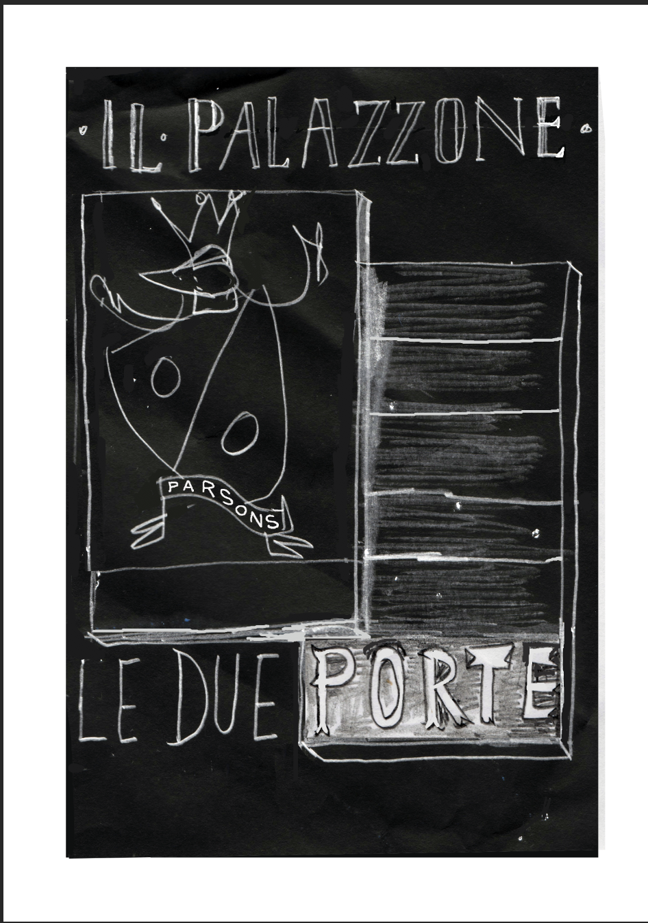
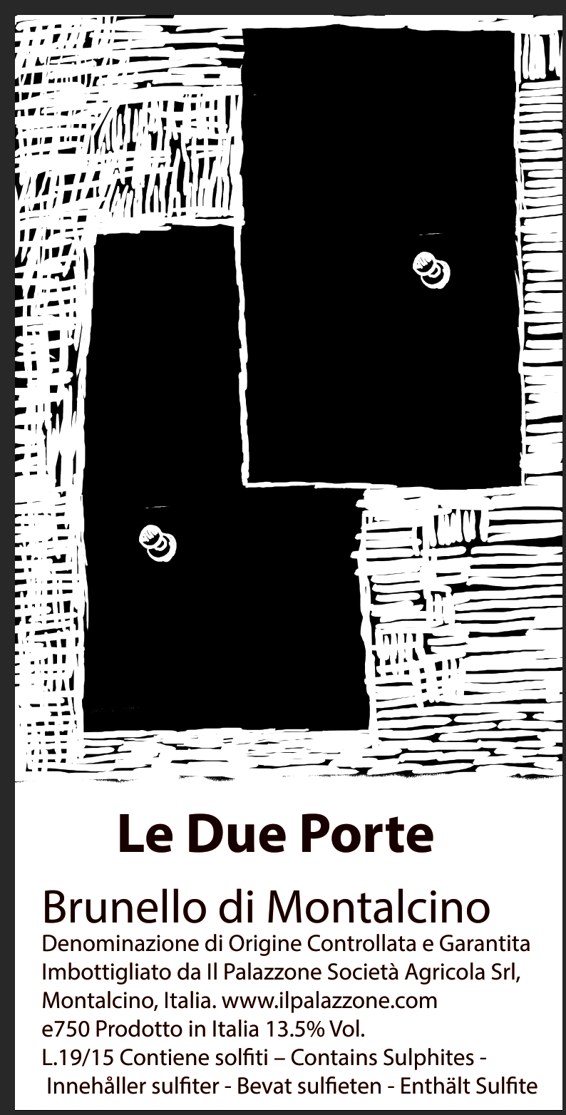
Le Due Porte : The Label
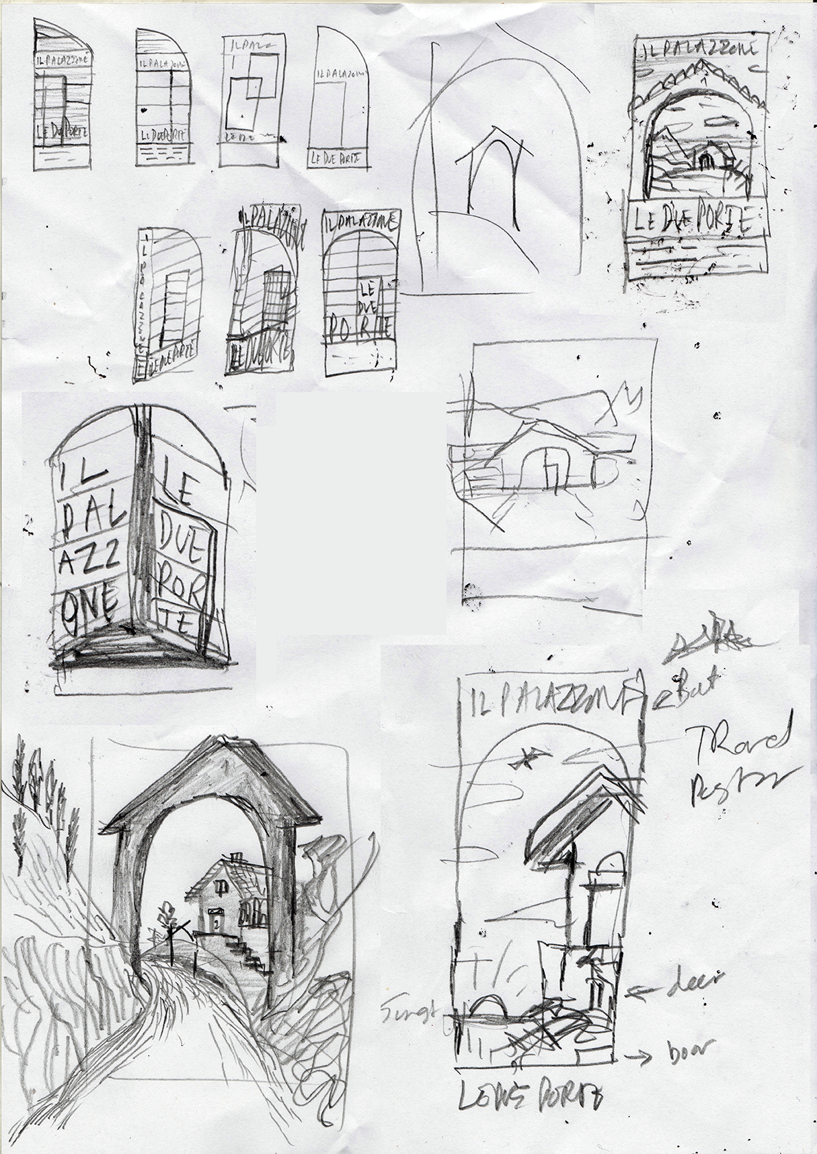
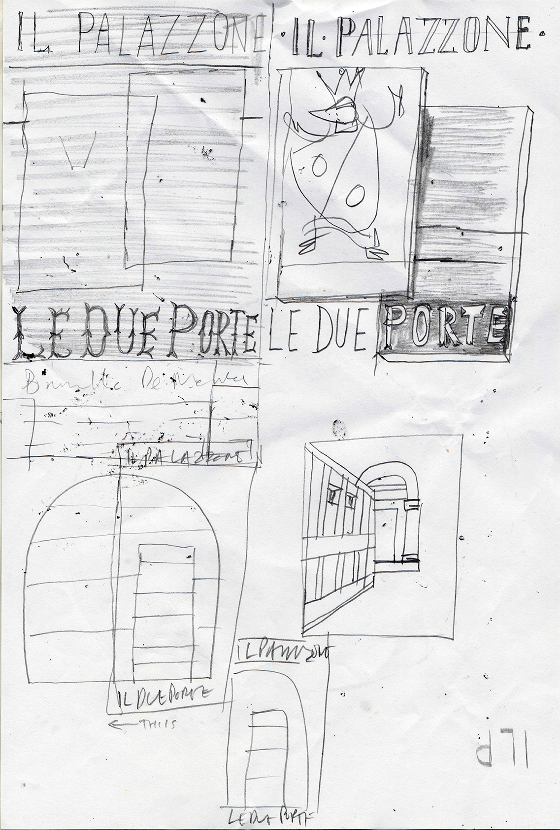
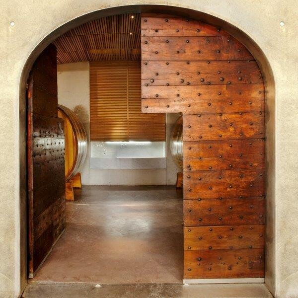
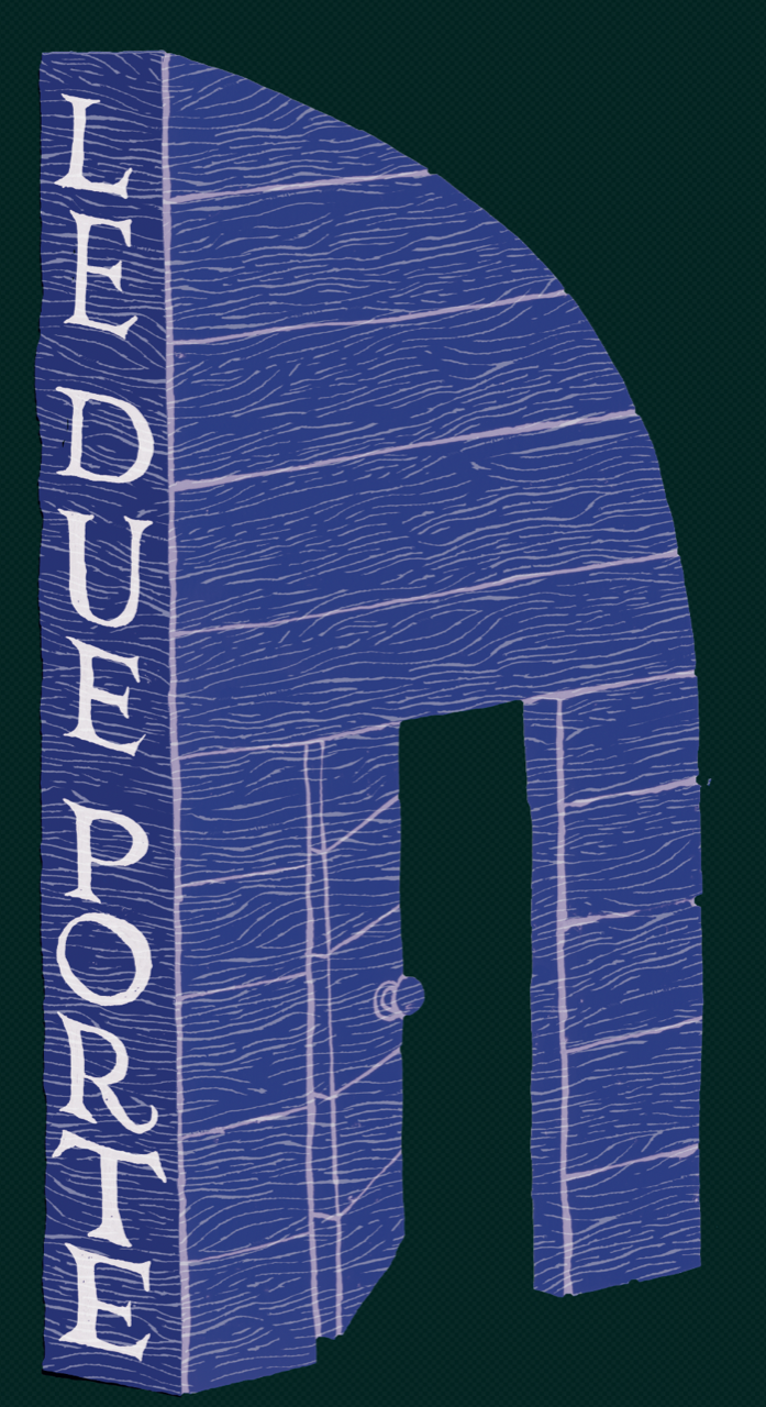
When we decided to make a wine with fruit only from Le Due Porte vineyard, our inspiration for the label came from the doors that lead to our aging cellar. We bought the 240 cm wide, 280 cm tall (about 8 feet by 9 feet) doors before we built the cellar and they were originally in an 18th century Piedmontese convent. They are made of solid dark cherry wood and studded with nails and have a wicket gate, a smaller door embedded in the large door - a person-flap of sorts. At some times of the year it can be very useful to limit the exchange of air between inside and outside; to stop flies coming in during fermentation or to prevent changes in temperature due to extremes of heat and cold and yet we need doors that also allow the passage of our large barrels. We discovered that those naughty nuns had two separate keys, one for opening and one for closing but that is a different story.
After the wonderful collaboration for our grappa label, the obvious choice for this commission was Chris Watson , someone I have known all my life. Chris trained in fine art painting in the Macintosh Studios in Glasgow School of Art & the School of the Art institute of Chicago, followed by a Masters in Sequential Illustration at Brighton University. He works as an illustrator and graphic designer for clients in publishing, music, drinks, fashion and online. He is also an educator and has far too many books, but keeps uncovering new and ancient things to add to his unique mix of influences. The online store for his printmaking is here.
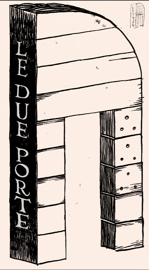
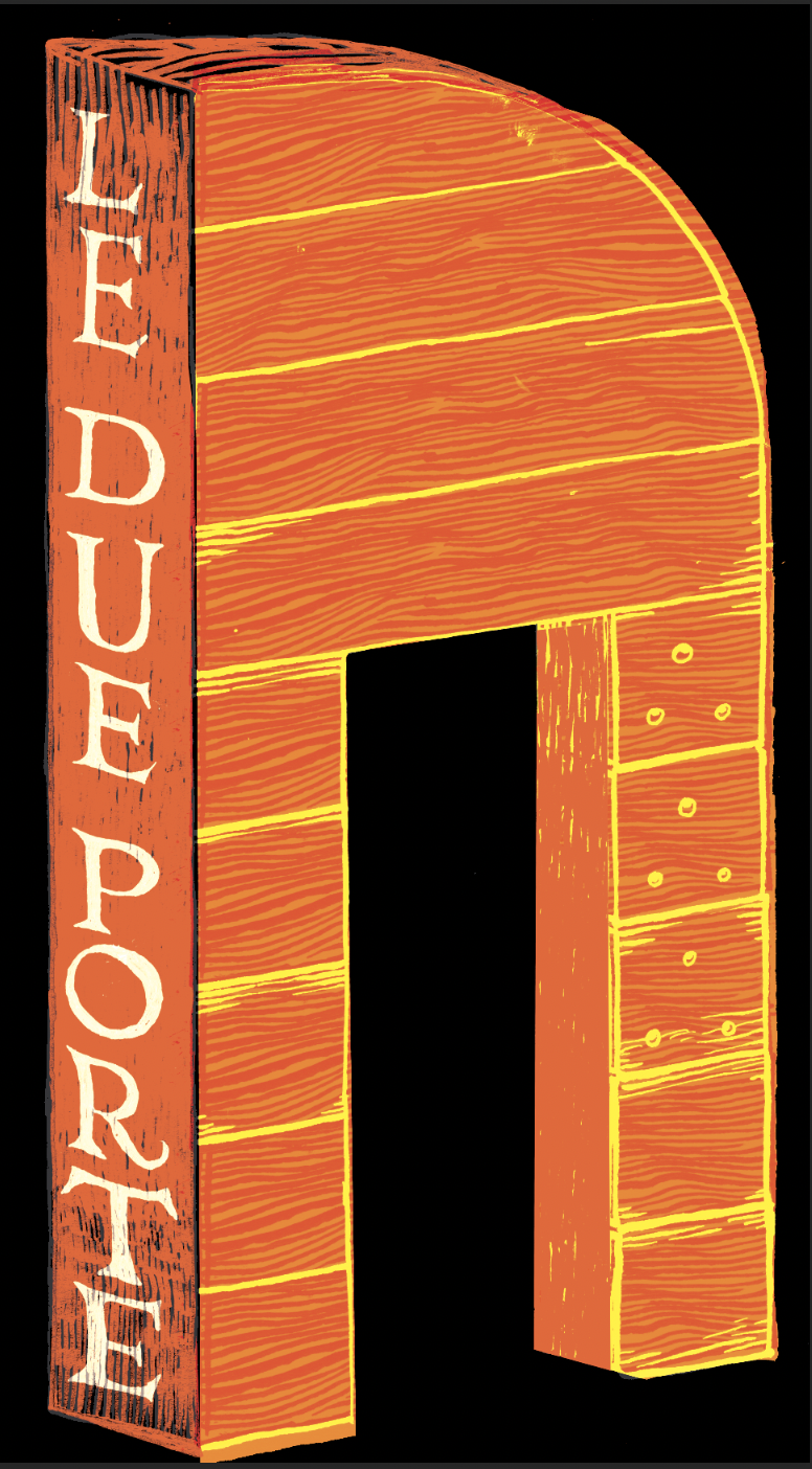
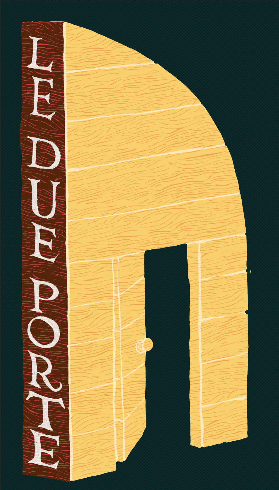
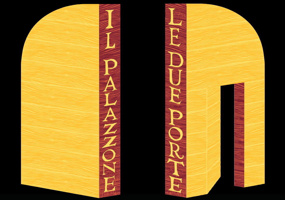
Our inspiration for this label initially came from various big hitters of illustration and printmaking such as Eric Fraser, Edward Bawden, J.G. Posada, Cyril Power and the Vorticists. The design evolved rapidly from the idea of a lino-cut or wood cut to the final playful and self-referential idea of using two custom made die-cut doors, which use the dark bottle as a picture element instead of the conventional front or back. The color scheme is ochre and garnet, two very Tuscan colors that convey the relationship between soil and wine. Technically the cut-away door was a challenge, as was the matching front and back labels since label traditions are for the back labels to be smaller. Hand-lettered by Chris in Glasgow using antique steel nib pens, Indian Ink and digital tools, it was inspired by Roman lettering & illuminated manuscripts.
We are terrifically proud of the results.